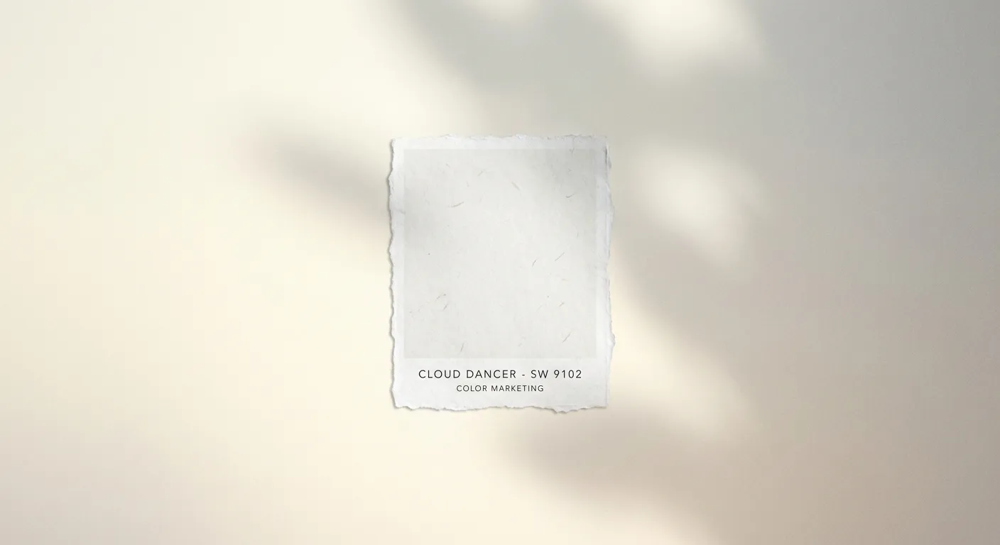
For the first time in the 26-year history of its Color of the Year program, Pantone has chosen a shade of white. Cloud Dancer, officially designated 11-4201, is a warm, creamy white with faint yellow undertones that the Pantone Color Institute describes as "reassuring, restorative, and imbued with a sense of hope." The choice immediately split the design world into camps: those who see it as a profound cultural statement, and those who see it as a company choosing not to choose.
The selection matters more than the debate suggests. Pantone's annual pick reliably influences $3 billion to $5 billion in consumer product decisions over the following 18 months, according to estimates from the Color Marketing Group, a trade association that tracks color's commercial impact. Fashion houses, automotive manufacturers, consumer electronics brands, and home goods companies all calibrate product lines around the announcement. Leatrice Eiseman, executive director of the Pantone Color Institute, told Dezeen magazine that Cloud Dancer represents "a collective exhale after years of visual overstimulation."
How Pantone Actually Picks Its Color
The selection process is more rigorous than most people realize. Pantone's team of color trend analysts spends the better part of a year gathering data from fashion weeks in Milan, Paris, New York, and Tokyo, monitoring social media aesthetics across platforms, visiting international trade shows from CES to Salone del Mobile, and tracking shifts in architecture, film, and automotive design. Laurie Pressman, the institute's vice president, told Business of Fashion that the 2026 cycle involved analyzing "over 15,000 data points across 40 countries" before the shortlist narrowed to three finalists.
Cloud Dancer beat out a muted sage green and a dusky terracotta for the title, both colors that would have continued the earthy, nature-inspired trajectory of recent years. The decision to break that pattern with white was, according to Eiseman, deliberate. "After Viva Magenta and Peach Fuzz, which both asked people to feel something boldly, we felt the cultural moment was asking for permission to feel nothing for a moment. To breathe."
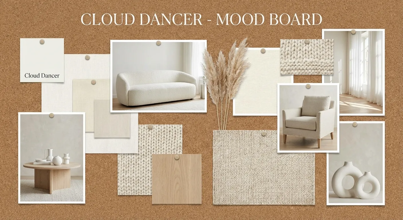
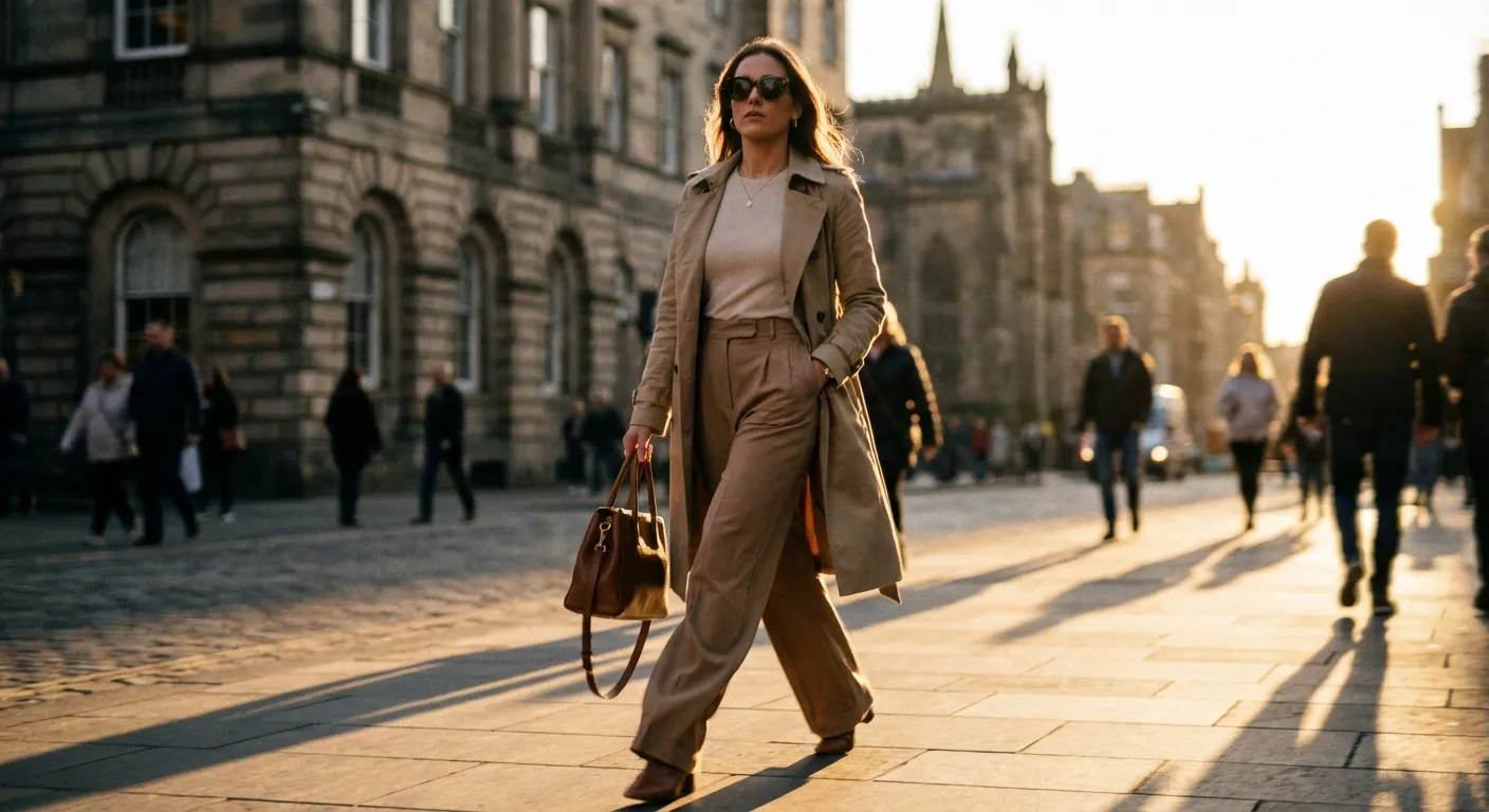
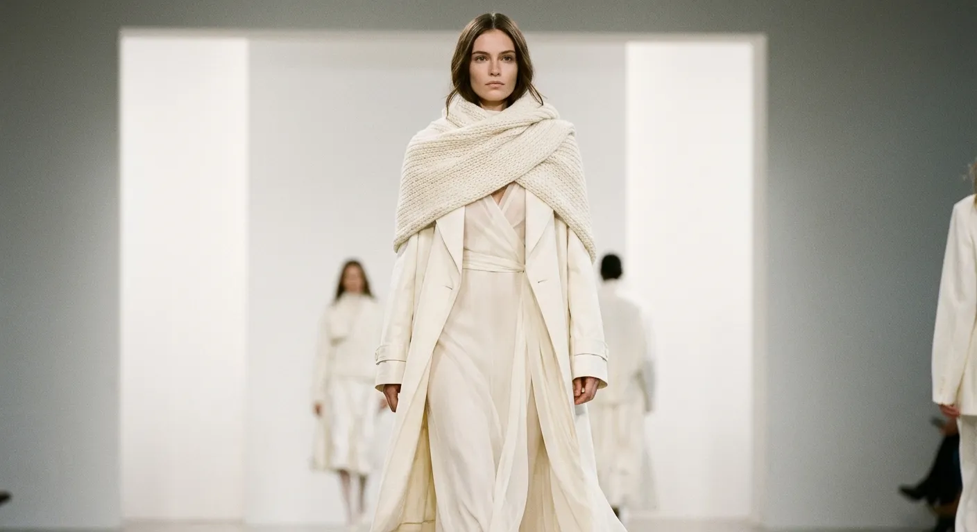
The choice also reflects what Pantone calls the "quiet luxury" movement that has reshaped fashion and design since 2023. Brands like The Row, Loro Piana, and Brunello Cucinelli have built enormous cultural cachet around understated, monochromatic aesthetics where quality of materials matters more than visual volume. Cloud Dancer is, in many ways, the logical endpoint of that trend: the point where color recedes entirely and texture, form, and finish carry the design.
The Commercial Ripple Effect
Within days of the announcement, the industry began responding. Sherwin-Williams confirmed that its 2026 paint collections would feature Cloud Dancer-adjacent whites prominently, with regional marketing director Patricia Verrier telling Architectural Digest that warm whites already represent "the fastest-growing segment in residential paint, up 23% year over year." Samsung's design team in Seoul has reportedly incorporated the shade into upcoming Galaxy device colorways for the second half of 2026. Zara, H&M, and COS have all signaled spring collections built around warm neutrals that align with the broader trend.
The impact extends into digital spaces. UI and UX designers have noted a shift toward lighter, more spacious interfaces that mirrors the physical design trend. Apple's recent iOS updates, with their emphasis on translucency and light backgrounds, already anticipated the direction that Cloud Dancer now codifies.
The Backlash and Its Limits
The criticism arrived almost as quickly as the announcement. Design commentators on social media called the choice "aggressively safe," and the practical objections wrote themselves: white shows every stain, scuff, and fingerprint. For families with children, pets, or any connection to the physical world, embracing Cloud Dancer as a dominant palette feels aspirational to the point of absurdity.
Cultural critics raised sharper concerns. In a widely shared essay for It's Nice That, design writer Alice Rawsthorn argued that "choosing white in a moment of profound global inequality risks reading as retreat into privilege rather than a genuine pursuit of calm." The collectibles and consumer trends driving actual spending suggest consumers are drawn to color and personality, not minimalist restraint.
Pantone has weathered similar pushback before. When the institute chose Classic Blue for 2020, critics called it boring. Classic Blue went on to appear in products generating an estimated $4.1 billion in sales, according to the Color Marketing Group's retrospective analysis. The gap between critical reception and commercial impact has historically favored Pantone's instincts.
The Conversation
Pantone's selection of Cloud Dancer is commercial savvy dressed up as cultural commentary, and the evidence in this article supports that reading more convincingly than the exhaustion narrative. The quiet luxury movement has already proven its commercial viability through the success of brands like The Row and Loro Piana. Warm whites are the fastest-growing paint segment, up 23% year over year. Classic Blue, Pantone's last "safe" pick, generated $4.1 billion in product sales. Cloud Dancer is not a retreat from the marketplace. It is a calculated bet on a trend that consumer spending has already validated. Rawsthorn's critique about privilege has merit as cultural analysis, but Pantone's job is to predict where commercial design is heading, not to make political statements through pigment. By that measure, choosing the color that the market was already buying is less an abdication than an acknowledgment. Cloud Dancer will saturate product lines, store displays, and feeds through 2027, and the sales data will almost certainly vindicate the choice.
Sources
- Pantone Color Institute: Color of the Year 2026 - Pantone
- Dezeen: Lofty white Cloud Dancer named Pantone Colour of the Year 2026 - Dezeen, December 2025
- NPR: Pantone chooses white Cloud Dancer as its 2026 Color of the Year - NPR, December 2025
- Elle Decor: Pantone's 2026 Color of the Year Is Its Most Surprising Yet - Elle Decor, December 2025
- Sherwin-Williams: Color of the Year 2026, Universal Khaki SW 6150 - Sherwin-Williams