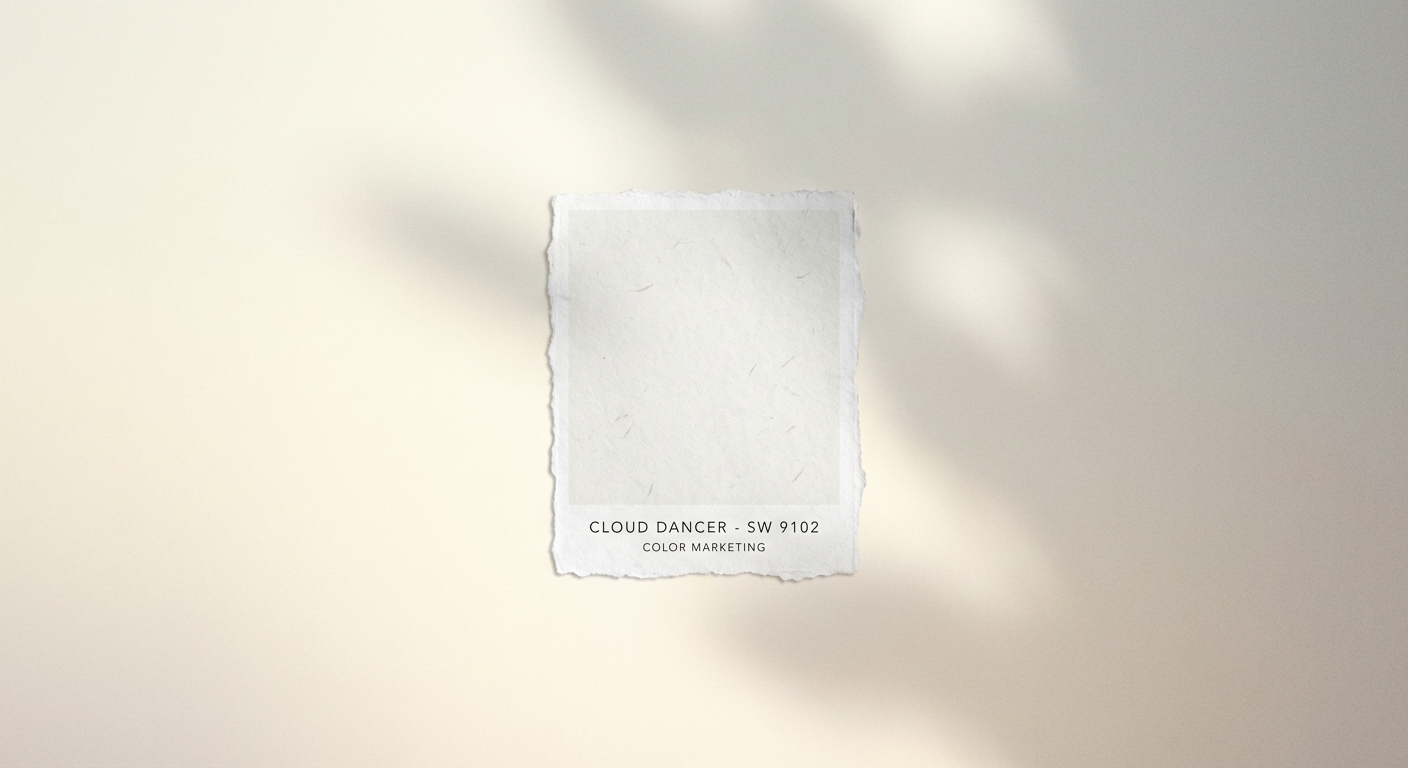
Pantone just announced its Color of the Year for 2026, and for the first time in the award’s 26-year history, it’s a shade of white. Cloud Dancer, as they’ve named it, is a warm, creamy white that the company describes as “reassuring, restorative, and imbued with a sense of hope.”
If you’re thinking “they picked white? that’s not even a color,” you’re not alone. The choice has already sparked debate among designers and trend forecasters who expected something bolder after recent selections like Viva Magenta (2023) and Peach Fuzz (2024). But Pantone’s picks are never arbitrary. They’re meant to capture the cultural zeitgeist, and apparently, the zeitgeist right now wants a blank slate.
The selection matters because Pantone’s Color of the Year influences everything from fashion collections to interior design to product packaging. When Pantone speaks, industries listen.
What Cloud Dancer Actually Looks Like
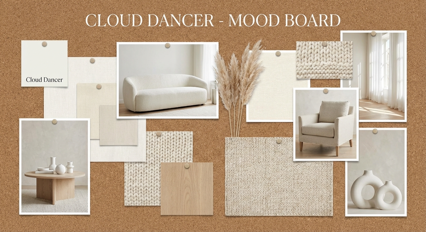
Cloud Dancer isn’t pure white. It’s warmer, with subtle undertones that make it feel softer and more approachable than stark optical white. Think of the color of whipped cream, or the inside of a vanilla bean, or clouds at golden hour. It’s white with depth.
Pantone positions it as part of the “quiet luxury” movement that has dominated fashion and design recently. While that trend has started showing signs of fatigue, the company argues that Cloud Dancer represents its essence: understated elegance, quality materials, and confidence that doesn’t need to shout.
The name itself is telling. “Cloud Dancer” evokes lightness, freedom, and optimism. It suggests movement and possibility rather than the blankness that pure white can convey. Pantone’s naming is always deliberate, designed to give the color emotional resonance beyond its technical specifications.
Why White, and Why Now
Pantone’s color selections are based on extensive research into cultural, social, and economic trends. The company’s color experts travel globally, attending fashion weeks, art exhibitions, and trade shows while monitoring everything from social media aesthetics to geopolitical developments.
Their read on the current moment: people are exhausted. After years of crisis layered on crisis, from pandemic to political upheaval to economic uncertainty, there’s a collective desire for simplicity and calm. Cloud Dancer is meant to provide visual breathing room.
The choice also reflects practical realities in design. Neutral bases allow for personalization and flexibility. A white foundation can be accented with any other color, making it inherently versatile. For brands and designers facing uncertain markets, that flexibility is valuable.
Critics argue that white as a Color of the Year feels like a cop-out, a safe choice that avoids making any real statement. But Pantone’s executive director Leatrice Eiseman pushed back on that interpretation, noting that white requires confidence. “Anyone can hide behind color,” she said in the announcement. “White demands authenticity.”
What This Means for Your Life
Unless you work in design, fashion, or marketing, Pantone’s Color of the Year might seem irrelevant. But these selections have a way of trickling down into consumer products over the following 12 to 18 months.
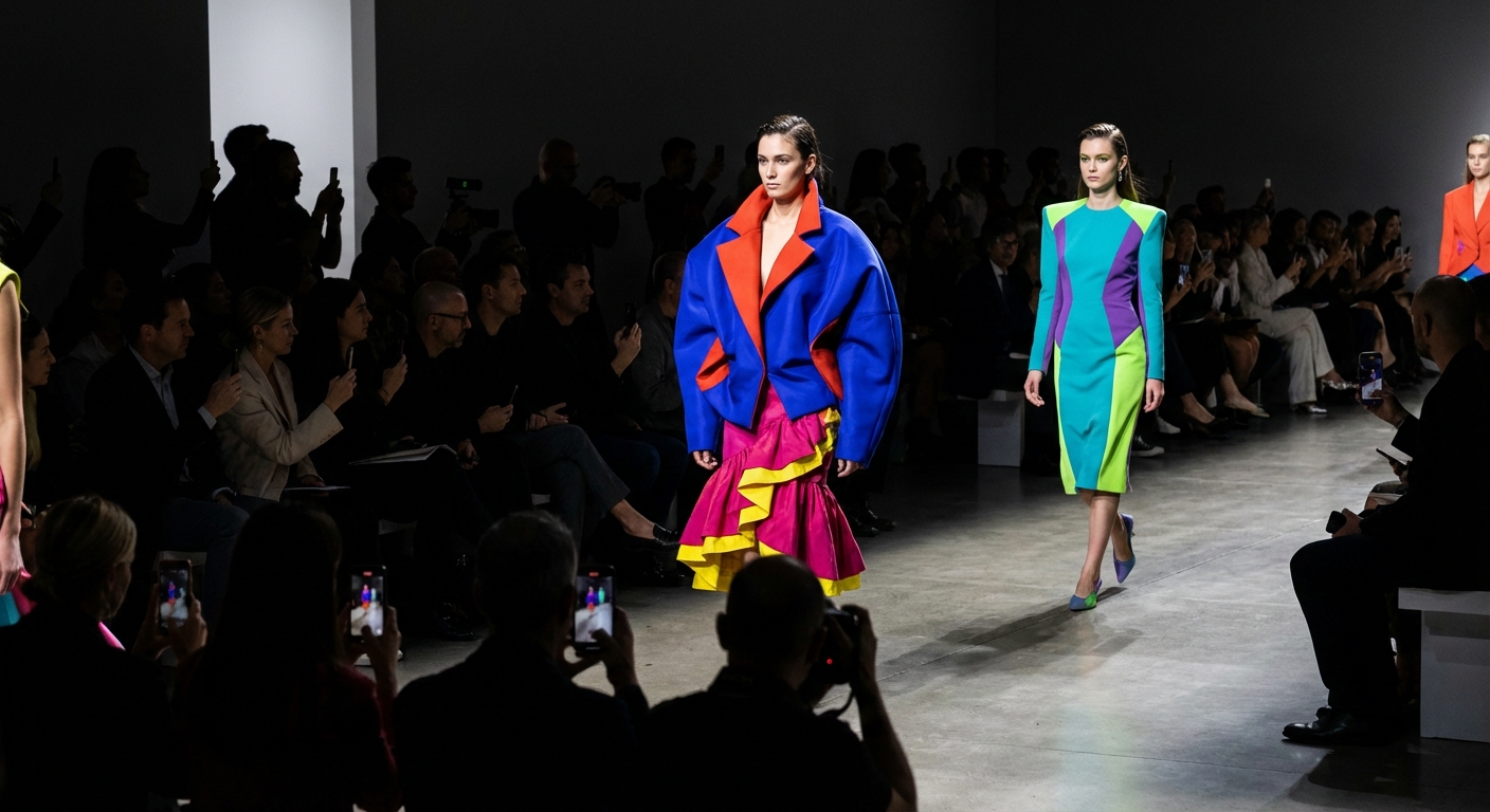
Expect to see Cloud Dancer appearing in home goods, from bedding to kitchen appliances to furniture. Fashion brands, especially in the accessible luxury segment, will incorporate more warm whites into their collections. Tech companies, always looking for ways to differentiate products visually, may embrace the shade for device finishes and packaging.
The color also validates existing trends. If you’ve been gravitating toward lighter, softer aesthetics in your home or wardrobe, you’re ahead of the curve. The industry is officially blessing what many consumers have already been choosing.
The Backlash Is Already Here
Not everyone is celebrating. Design Twitter and TikTok have been full of takes ranging from bemused to annoyed. The most common complaint: white is impractical. It shows every stain, every scuff, every imperfection. For families with kids or pets, embracing Cloud Dancer as a dominant color feels like an invitation to frustration.
Others see the choice as tone-deaf. In a moment when many people are struggling economically, celebrating a color associated with pristine, high-maintenance luxury feels disconnected from reality. White furniture and white clothes require either professional cleaning or significant time and money to maintain.
There’s also the argument that Pantone has become too conservative. The Color of the Year used to generate excitement and push trends in new directions. Picking white, even a warm white with a poetic name, feels like retreating to safety rather than leading.
The Bottom Line
Pantone’s selection of Cloud Dancer as the 2026 Color of the Year is either a profound statement about our collective need for peace and simplicity, or a bland choice that refuses to take a stand. Probably both, depending on your perspective.
What’s undeniable is that the selection will influence products and designs you encounter over the coming year. Whether you love it or find it uninspiring, you’ll be seeing a lot more warm white in stores, homes, and wardrobes.
For Pantone, the choice represents a bet that people want calm over stimulation, simplicity over complexity, and breathing room over visual noise. Whether that read proves accurate will become clear as 2026 unfolds.